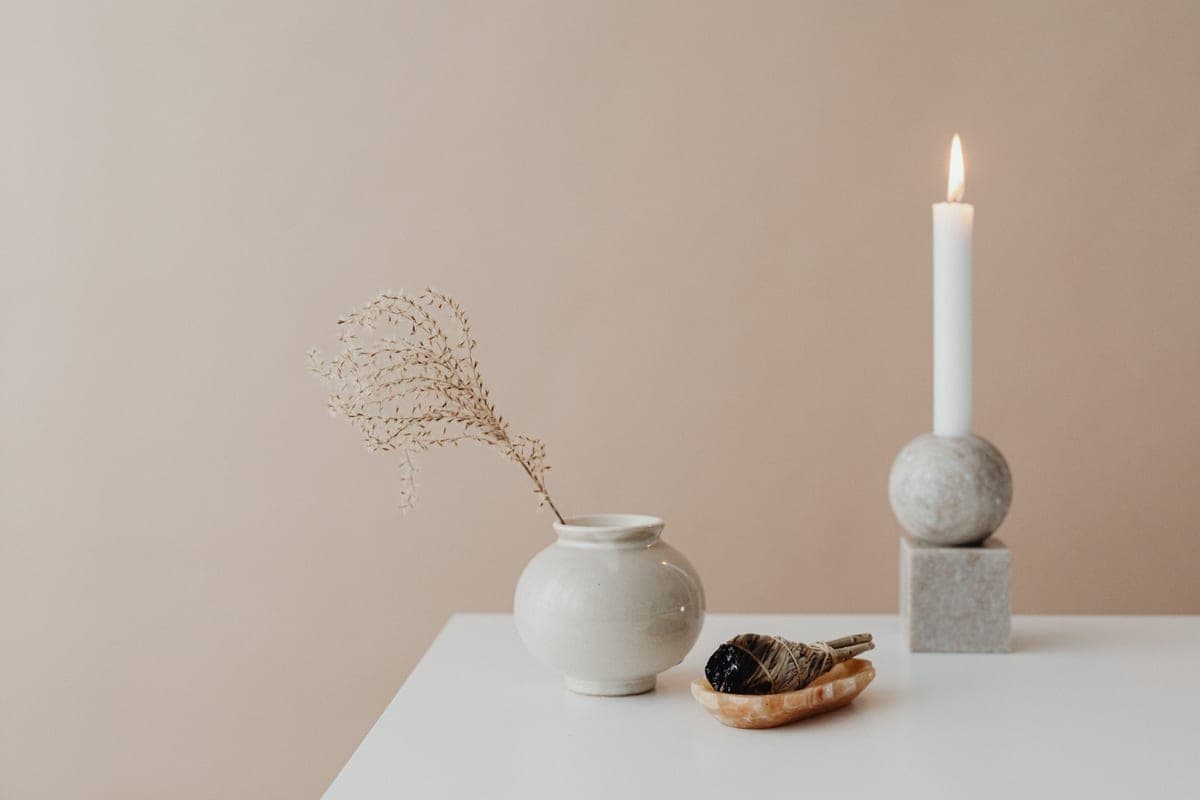
Bedsure Chunky Knit Throw Blanket
Best for testing the earthy palette
The no-commitment way to test 2026's warm, earthy palette in your own light.
The 2026 trends worth your money, and the ones I'd let pass.
By Catherine Vizcaino · Home-renovation pro & founder
Updated August 2026

As an Amazon Associate, I Heart My Home earns from qualifying purchases. It never changes your price or our picks. Learn more.
Every year the internet floods with “trend” lists, and most of them are noise — micro-fads that will look dated by the time you’ve finished repainting. This isn’t that. I pulled the 2026 trends that show up across serious industry research and, more importantly, the ones I’m actually seeing land in real homes and hold up once the novelty wears off.
The throughline is warmth. After years of cool gray and clinical white, 2026 is decisively earthy, layered, and lived-in: richer color, natural materials, and rooms that feel collected rather than staged. That’s backed by designer surveys and by the paint industry’s own 2026 color picks, and it happens to be a direction that ages well, which is why I’m comfortable telling clients to lean into it.
A quick note on money: some links below earn a small commission as an Amazon Associate, at no cost to you and with no effect on what I recommend. You’ll see a Check price on Amazon button rather than a price I can’t promise. Here are the trends worth your attention, in order.
Best for testing the earthy palette
The no-commitment way to test 2026's warm, earthy palette in your own light.
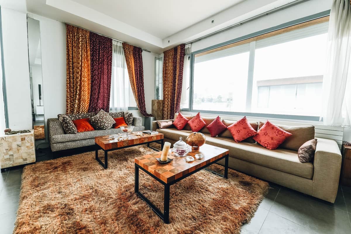
Best for warm vintage color underfoot
A faded, vintage-look rug brings terracotta and rust in without any bravery required.
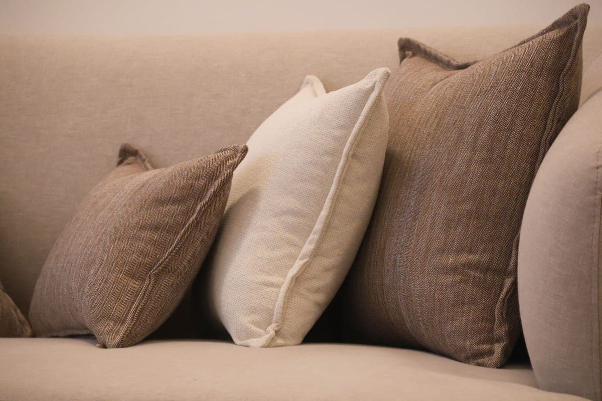
Best for a low-risk pop of burgundy
Velvet in burgundy reads rich, not dark, and it's a small change, not a repaint.
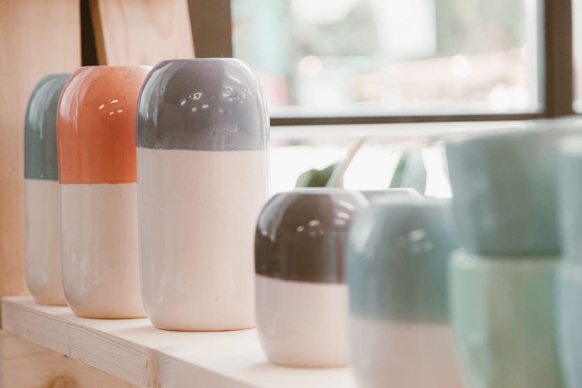
Best for earthy tabletop styling
Matte earthy ceramics look far more expensive than they cost. Group them in odd numbers.
If one trend defines 2026, it’s the return of warm, earthy color after a decade of cool gray and stark white. In the 1stDibs 2026 Interior Design Trends survey, chocolate brown was the runaway favorite — named by roughly a third of the designers polled, about double its share a few years earlier — with butter yellow and burgundy close behind. These aren’t loud colors; they’re grounded, cozy, and easy to live with, which is exactly why they’re sticking.
The major paint brands landed in the same place for their 2026 Colors of the Year. Sherwin-Williams chose a warm earthy khaki, Benjamin Moore went with a deep espresso-toned neutral, and even Pantone leaned soft and warm rather than bright. When the survey data and the paint companies agree, you’re looking at a durable direction, not a passing fad.
The good news for your wallet: you don’t have to repaint to try this. Bring the palette in through textiles and accents first — a rust throw, terracotta ceramics, a warmer wood tone — and see how it feels before you commit a whole wall. That’s the approach I walk through in our broader home decor ideas guide.
Minimalism isn’t dead, but maximalism is clearly ascendant. In the same 1stDibs survey, maximalism was the most-cited style direction for 2026, edging out eclecticism — both up from previous years. The key word, though, is intentional. This isn’t clutter; it’s confident layering of color, pattern, and collected objects so a room tells a story instead of looking like a showroom.
If you’ve always found spare rooms a little cold, this is your permission slip. Start with a patterned rug or a bold wall, then layer in complementary colors, mixed textures, and personal pieces — art, books, ceramics, things you actually love. The trick that separates “maximalist” from “messy” is a limited palette: three or four colors repeated across the room hold all that variety together. Our maximalist decor guide breaks the approach down step by step, and you can compare it against calmer directions in our full list of home decor styles.
Designers are reaching for the past. The 1stDibs survey found that vintage and antique pieces made up their highest share of sourced items in years — more than a third — as buyers chase character, quality, and sustainability over disposable furniture. A single old piece — a worn wood dresser, a patinated mirror, a mid-century chair — instantly makes a room feel collected rather than catalog-ordered.
You don’t need a big antiquing budget to get the effect. Mixing one or two genuinely old pieces with newer basics is enough, and the contrast is the whole point: the new keeps it from feeling like a museum, the old keeps it from feeling generic. Reproductions and vintage-look pieces can bridge the gap where real antiques are scarce or pricey. Our vintage decor guide covers where to look, what’s worth buying old, and how to blend eras without it looking like a costume.
Color drenching — painting the walls, trim, and sometimes even the ceiling in a single saturated color — is one of the most-talked-about looks of 2026, and it pairs naturally with the year’s deep, warm palette. Wrapping a room in one enveloping tone (a chocolate brown, a deep green, a burgundy) makes it feel intentional, cocooning, and surprisingly restful, because your eye isn’t stopped by contrasting trim.
It sounds bold, and it photographs dramatic, but it’s forgiving in practice: a single color is far easier to get right than a scheme of coordinating ones. If a whole room feels like too much, start with a powder room, a study, or an accent nook — small spaces are the perfect low-stakes place to test a moody, drenched look. Keep the finish consistent and let warm lighting and natural textures soften the effect so it reads cozy, not cave-like.
Alongside the color story, 2026 is a tactile year. The survey pointed to a strong appetite for natural, handmade materials — wicker and rattan, unlacquered woods, stone, plaster, and linen — and for softer, curvier shapes over hard right angles. Curved sofas, rounded mirrors, arched details, and skirted seating all showed up as rising preferences.
What this means for real rooms is texture and warmth: a jute or wool rug, a rattan accent chair, chunky knit and linen textiles, matte ceramics, and wood you can see the grain of. These materials read as calm and grounded, and they play beautifully with the earthy palette. You don’t need to chase curves everywhere — one softly rounded piece, a mirror or a chair, is enough to break up a boxy room. For the pieces that pull this together on a budget, our roundup of the best home decor on Amazon is a good place to start.
Here’s my honest take as someone who has to live with these decisions long after the trend cycle moves on: adopt the trends you love through small, reversible pieces, and be slow about the permanent ones. Textiles, ceramics, art, and a rug can all carry the 2026 look and can all be swapped in a few years without regret or a repaint.
Save the big commitments — wall color, a sofa, flooring — for the choices that are genuinely you, not just current. Warm and earthy is a safe long-term bet because it’s rooted in comfort rather than novelty; ultra-specific micro-trends are the ones that date. If you want a starting shopping list, I’ve pulled together on-trend, budget-friendly picks in our cheap home decor roundup and step-by-step help in the decorate on a budget guide. And if you’re decorating a whole space, start with our home decor ideas hub for the order to do it in.
The major paint brands each named a warm, earthy 2026 color of the year. Sherwin-Williams chose a warm khaki neutral, Benjamin Moore chose a deep espresso-toned neutral, and Pantone leaned soft and warm. Together they confirm the year’s clear shift toward grounded, cozy, earthy tones and away from cool grays. Verify the exact shades on the Sherwin-Williams and Benjamin Moore sites, since names change each year.
Cool, blue-based grays are fading, but gray itself isn’t banned. The shift is toward warmth, so warmer greige and mushroom tones still work beautifully. If you have a cool-gray room, you don’t need to repaint everything — warm it up with earthy textiles, wood tones, and warmer bulbs first, and see how far that gets you before committing to paint.
Maximalism and eclecticism lead the 2026 style surveys, both emphasizing intentional, layered, personal rooms over spare minimalism. Vintage and antique mixing is strong too. The common thread is warmth and character — collected-looking spaces with rich color, natural texture, and pieces that feel personal. Our maximalist and vintage guides show how to get each look.
Adopt trends through small, reversible pieces — pillows, throws, ceramics, art, a rug — and keep the permanent choices like wall color, sofas, and flooring more timeless. Warm, earthy tones age well because they’re rooted in comfort, not novelty. Ultra-specific micro-trends are the ones most likely to look dated quickly, so spend the least on those.
Color drenching means painting the walls, trim, and sometimes the ceiling all in one saturated color for an enveloping, cohesive effect. It suits 2026’s deep, warm palette and is surprisingly forgiving, since one color is easier to get right than a coordinated scheme. Try it first in a small room — a powder room or study — where the stakes are low.
Browse the roundups I'd actually hand a client — honest picks, real trade-offs, and the one to buy first.